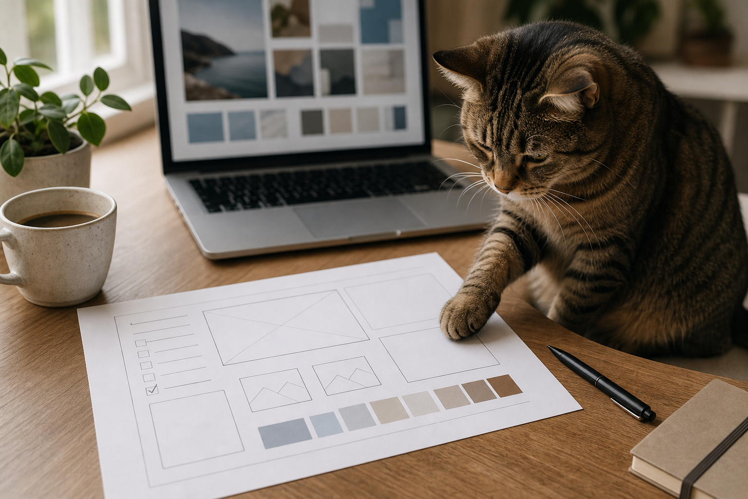
A vague request such as “make a nice image for this post” leaves too many decisions open. The image maker has to guess the subject, the useful detail, the mood, the crop, and what must stay out. An AI tool may fill those gaps confidently, but its guesses can pull the visual away from the article.
An AI image brief gives the model a smaller, better-defined job. You provide the article’s purpose and visual constraints; AI helps organize them into a brief that a designer, photographer, image generator, or future you can follow. The output is a one-page brief plus a review sheet. You can build both with a general AI assistant and a document editor. Paid software is not required for the planning work.
This method suits bloggers and small editorial teams that already know what their post says. It is less useful when the article is still changing or when you expect the model to invent a visual strategy without context.
Table of Contents
- Why a summary is not an image direction
- Collect evidence before asking for concepts
- Build the AI image brief in seven steps
- Use a visual hierarchy instead of a prop list
- Prompt AI to challenge the brief
- Worked example: an article about planning FAQs
- Write exclusions that prevent predictable mistakes
- Review the visual beside the article
- Where image briefs still fall short
- Turn the next article into a visual decision
Why a summary is not an image direction
A summary explains what the article says. A visual direction explains what the reader should notice in the image and why it belongs beside the article.
Suppose a post teaches readers how to build an FAQ section from real questions. A summary might mention reader intent, candidate questions, answer drafting, and review. Feeding that paragraph into an image generator can produce speech bubbles, question marks, dashboards, or generic office scenes. Each has a loose connection to the topic. None shows the workflow clearly.
A stronger direction names one moment: an editor compares a finished article with a short question worksheet before selecting the final FAQ entries. That sentence supplies an actor, an action, and an artifact. It also gives you something concrete to reject. If the resulting image shows a call center or a wall of floating punctuation, it missed the moment.
The brief should not describe every paragraph. Pick the part that makes the article different from another post in the same category. For a content audit, that may be a spreadsheet review. For an outline repair workflow, it may be a marked-up outline. For an image-brief article, it is the planning sheet itself.
Collect evidence before asking for concepts
Start with the finished or nearly finished article. Pull information from the text rather than from memory:
- the reader’s problem;
- the concrete output they will create;
- one action that can be shown without a caption;
- the object that proves the action is happening;
- the tone of the advice;
- the likely placement and crop;
- brand colors or recurring visual details;
- legal, privacy, or accuracy restrictions.
Add the site’s recent visuals. You are looking for continuity and repetition at the same time. A warm desk scene might belong to the brand, while another laptop-plus-coffee composition may feel interchangeable with the previous five posts.
Google Search Central’s image SEO guidance recommends using high-quality images near relevant text and writing descriptive alt text. Those are useful publication checks, but they do not choose the concept for you. The concept still needs to serve the article.
Keep sensitive material out of the AI input. Replace client names, unpublished product screens, private analytics, faces without permission, and credentials with neutral placeholders. A planning model does not need the original secret to understand that a screen should be blurred or excluded.
Build the AI image brief in seven steps
1. Write the image’s job in one sentence
Complete this sentence: The image should help the reader recognize... A useful ending names the workflow, not a mood. For example: ...a human editor turning article evidence into a short FAQ plan.
2. Choose one visible moment
Select a single action that could be photographed or illustrated. Comparing, sorting, marking, arranging, and reviewing are easier to show than “improving” or “creating value.” Avoid combining the whole tutorial into one frame.
3. Name the primary artifact
Decide what deserves the clearest space: worksheet, outline, content calendar, checklist, spreadsheet, or annotated draft. If the article promises a template, that template should not become a tiny background prop.
4. Rank supporting elements
Choose two or three supporting objects only after the primary artifact is settled. A laptop can provide context. A pen can suggest review. Decorative objects should not compete with the useful part of the scene.
5. Define composition and crop
State the intended format, focal area, and safe space. A WordPress featured image often needs a landscape composition that still reads when cropped into archive cards. Do not put the only important detail at an edge.
6. Set realism and text rules
Say whether you want editorial photography, a diagram, a screenshot, or an illustration. If generated text is not essential, ban readable text entirely. Ask for blank fields, abstract lines, or simple marks instead. Fake labels are distracting and can make an otherwise good image unusable.
7. Add acceptance checks
Finish with observable tests. Count people or animals. Check hands and paws. Look for logos, private data, nonsensical controls, hidden artifacts, and awkward crops. “Looks professional” is not a test.
Use this compact worksheet:
ARTICLE TITLE: [TITLE]
READER PROBLEM: [ONE SENTENCE]
ARTICLE OUTPUT: [TEMPLATE, CHECKLIST, PLAN, OR OTHER ASSET]

IMAGE JOB: Help the reader recognize [WORKFLOW OR RESULT].
VISIBLE MOMENT: [ONE ACTION]
PRIMARY ARTIFACT: [THE MAIN OBJECT]
SUPPORTING ELEMENTS: [UP TO THREE]
VISUAL HIERARCHY: [FIRST / SECOND / BACKGROUND]
STYLE AND LIGHT: [EDITORIAL PHOTO, DIAGRAM, ETC.]
COMPOSITION: [ASPECT RATIO, FOCAL AREA, SAFE SPACE]
BRAND CONTINUITY: [COLORS OR RECURRING MOTIF]
EXCLUDE: [TEXT, LOGOS, PEOPLE, PRIVATE UI, EXTRA OBJECTS]
ACCEPTANCE CHECKS: [COUNT, ANATOMY, CROP, RELEVANCE, RIGHTS]
ALT-TEXT NOTES: [WHAT THE FINAL IMAGE ACTUALLY SHOWS]
Use a visual hierarchy instead of a prop list
Long prompts often become shopping lists: laptop, phone, notebook, coffee, plant, lamp, glasses, sticky notes, charts, and a smiling creator. The model may include most items while losing the point.
Rank elements by attention instead:
| Level | Purpose | FAQ-workflow example | Failure to watch for |
|---|---|---|---|
| Primary | Carries the article idea | Question-selection worksheet | Worksheet is cropped or unreadably small |
| Secondary | Shows the action | Editor’s hand marking candidates | Hand covers the useful area |
| Context | Locates the scene | Blurred article on laptop | Fake interface becomes the focal point |
| Accent | Connects to the brand | Subtle blue stationery | Accent color overwhelms the scene |
| Excluded | Prevents drift | Floating question marks and logos | Generic symbols replace the workflow |
A hierarchy also makes revision easier. You can say, “make the worksheet primary and move the laptop into soft background focus,” instead of regenerating with a longer list of adjectives.
Prompt AI to challenge the brief
The first AI task is diagnosis, not image generation. Give the model your notes and ask it to expose decisions you have not made.
Act as an editorial image-brief reviewer. Read the article notes and draft brief below.

Return a table with:
- decision already supported by the article
- missing decision
- visual risk created by that gap
- one question for the editor

Check the visible moment, primary artifact, hierarchy, crop, privacy, text, logos,
anatomy, brand continuity, and whether the concept could fit an unrelated article.
Do not invent brand rules or facts. Mark absent information as UNKNOWN.
Do not write an image-generation prompt yet.

ARTICLE NOTES:
[PASTE A REDACTED SUMMARY AND OUTPUT]

DRAFT BRIEF:
[PASTE]
Answer the questions yourself. Then ask for a production-ready version that preserves your decisions.
Rewrite the approved notes as a concise image brief for [DESIGNER / PHOTOGRAPHER / IMAGE TOOL].

Keep these fields: image job, visible moment, primary artifact, hierarchy, style,
composition, required elements, exclusions, and acceptance checks.
Use concrete nouns and observable actions. Remove decorative items that do not support
the article. Do not add text, logos, people, animals, interface details, or brand rules
unless they are explicitly approved below. Put uncertain items in REVIEW REQUIRED.

APPROVED NOTES:
[PASTE]
The final prompt can be shorter than the brief. The brief is the decision record; the prompt is an instruction for one production method.
Worked example: an article about planning FAQs
Consider a hypothetical article that helps a balcony-gardening blogger build a useful FAQ from a finished watering guide and reader questions. The promised output is a reviewed set of five questions. The first rough request says:
Create a modern image about using AI to make an FAQ. Show a laptop, question marks, plants, and a happy blogger. Make it engaging and professional.
A representative brief-review prompt returned this raw suggestion:
Use a bright futuristic workspace with a creator pointing at an AI dashboard. Add floating question-mark icons, several indoor plants, and bold FAQ text. Blue neon lighting will communicate technology and innovation.
The response followed the rough request but exposed its weakness. A dashboard, floating symbols, and neon lighting say “technology” without showing question selection. Bold generated text creates an avoidable error surface. The person adds identity and permission questions but contributes nothing to the workflow.
The human-revised direction is narrower:
| Brief field | Revised decision |
|---|---|
| Image job | Show that a useful FAQ is selected from article evidence, not invented from scratch |
| Visible moment | An editor compares a watering article with a five-row question sheet |
| Primary artifact | Paper question-selection worksheet with abstract lines and check marks |
| Secondary context | Laptop with a blurred article layout; small herb pot |
| Style | Natural editorial desk photograph with soft daylight and muted blue accents |
| Exclusions | No readable words, floating punctuation, logos, neon effects, faces, or private screens |
| Acceptance | Worksheet remains clear at archive-card size; objects and anatomy look natural |
That version could still be produced in several ways. A photographer could stage it. A designer could make a clean illustration. An image model could render the scene. The brief survives the tool choice because it records the editorial decision first.
The related Practical AI Flow guide on building an AI FAQ for a blog provides the underlying workflow used in this hypothetical concept. Linking the visual plan to a real editorial process keeps the example from becoming generic decoration.
Write exclusions that prevent predictable mistakes
Exclusions work best when they are tied to a reason. No text is clear. No readable text because the image will be localized and generated lettering is not needed is even better for a human collaborator.
Common exclusions include:
- no logos or copied interface screens unless permission and accuracy are confirmed;
- no identifiable customers, private documents, analytics, or credentials;
- no extra people or animals beyond the approved count;
- no tiny labels that must remain legible in a thumbnail;
- no misleading before-and-after claims;
- no visual result the article does not teach;
- no decorative AI symbols when a real workflow artifact can carry the idea.
Do not ban every possible problem. Focus on the mistakes likely for this concept. A brief with thirty negative rules becomes hard to follow and may still omit the main direction.
Review the visual beside the article
A technically clean image can still be wrong for the page. Review the final file next to the title, introduction, and promised output.
Ask these questions in order:
- Can a reader connect the image to this article rather than to “AI blogging” in general?
- Is the primary artifact easy to find at full size and thumbnail size?
- Does the scene show the action named in the brief?
- Are the approved counts correct?
- Do hands, paws, objects, reflections, and shadows look coherent?
- Is every visible word accurate and necessary? If not, remove or blur it.
- Are logos, faces, private screens, and copyrighted material handled appropriately?
- Does the crop leave the important part intact on the post and archive card?
- Does the alt text describe the finished image rather than repeat the prompt?
Write alt text after the image exists. The brief can hold notes, but it cannot predict every final detail. Keep the description natural and concise. If the image is purely decorative, your publishing setup and accessibility policy may call for different treatment than an informative workflow image.
Where image briefs still fall short
A strong brief reduces guessing; it does not guarantee a strong image. Generative tools can ignore counts, invent lettering, merge objects, or produce anatomy that looks plausible at first glance. A designer can misunderstand priorities. A photographer can discover that the planned composition does not work in the available space.
The brief also cannot settle rights questions by itself. Confirm licenses, releases, trademark use, and client permissions through the appropriate source or professional guidance. Do not ask AI to declare an image legally safe.
Visual consistency can become sameness. If every post uses the same desk, laptop, coffee, and plant, the archive loses useful distinctions. Keep a recurring brand cue, then vary the artifact, camera angle, light, surface, and action according to the article.
Finally, an image is not mandatory simply because an SEO plugin asks for one. Use a visual when it helps the reader recognize the workflow, understand an artifact, or navigate the page. Irrelevant filler wastes attention.
Turn the next article into a visual decision
Choose one finished post and write only three lines: the image’s job, the visible moment, and the primary artifact. If those lines are vague, do not generate anything yet. Return to the article and find the concrete action that makes it useful.
Once the three lines hold up, complete the worksheet, run the diagnostic prompt, answer its questions, and produce one candidate. Review that candidate beside the actual page. Save the accepted brief with the article package so the next revision starts from decisions rather than memory.